Using the Carleton College Wordmark
The Carleton wordmark is our official logo. Although we are officially named Carleton College, the word “College” has been dropped from the wordmark to provide greater flexibility and more visual emphasis with our brand identity. The wordmark must be included on all publications and other visual communications developed for the College. Please use this updated version for all new communication materials.
Use approved, unaltered versions of the wordmark only — do not attempt to type the wordmark in a similar font or to incorporate it in a sentence. The wordmark is a graphic element, not a typestyle.
To maintain the integrity of our visual identity, please follow the guidelines below.
Contact us if you have questions about how to use the official wordmark.
Download the Wordmark and Symbol Lock-ups
There are a limited number of wordmark and symbol combinations available for use. Using these “lock-ups” will ensure consistent scaling and visual alignment between the wordmark and symbol for situations in which they are in close proximity to each other.
Do not alter or deconstruct these lock-ups in any way or create lock-ups with other associated symbols not shown here.
Wordmark

Lockups


PNG format
Blue Logo
White Logo
SVG format
Blue Logo
White Logo
Approved wordmark colors and usage
The wordmark should only be used in four prescribed colors. If it is being used over a white or light-colored background, it should be used in black or in Carleton blue. If it is being used over a dark background, it should be used in white or Carleton maize.

Never screen (fade) the wordmark or print over it. You may print the wordmark over backgrounds and photos if there is enough contrast.
Clear Space
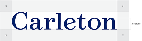
A minimum amount of clear space must always surround the wordmark to separate it from other elements, such as headlines, text, and imagery. Proper use of clear space ensures greater visual impact and legibility.
The minimum amount of clear space for the wordmark is equal to the “X-height” (height of a lower-case letter) in the wordmark. This minimum amount of clear space should exist on all four sides of the logo as demonstrated in the examples above. When possible, additional clear space is preferred.
Incorrect Colors and Usage
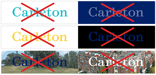
Never use the wordmark in unapproved colors or screen tints (fade) of the wordmark. Do not use approved wordmark colors on background colors that do not provide enough contrast. Never use the wordmark on images that are too busy or over important image details or on images that do not provide ample contrast.
Minimum Size
To ensure proper legibility, avoid producing the wordmark smaller than 0.75″ wide.